
Loke Yeanne Tung / 0343853
Bachelor of Design (Hons) in Creative Media / Taylor's University
Advanced Typography / Task 1: Exercises (20%)
LECTURES
Lecture 1: Typographic Systems
"ALL DESIGN IS BASED ON A STRUCTURAL SYSTEM."
According to Elam (2007), there are 8 major variations with an infinite number of permutations.
According to Elam (2007), there are 8 major variations with an infinite number of permutations.
|
TYPOGRAPHICAL ORGANIZATION
Hierarchy, order of reading, legibility, and contract also come into play.
01
Axial
All elements are organized to the left or right of a single axis (line in red).


Fig. 1.1 Axial system examples
02
Radial
All elements are extended from a point of focus.


Fig. 1.2 Radial system examples: Single vs multiple points of focus
Notes:
- Can have multiple points of focus.
03
Dilatational
All elements expand from a central point in a circular fashion.


04
Random
Elements appear to have no specific pattern or relationship.


Fig. 1.4 Random system examples
05
Grid
A system of vertical and horizontal divisions.


06
Transitional
An informal system of layered banding.


Modular
A series of non-objective elements that are constructed in as a standardized units.


Fig. 1.7 Modular system examples
08
Bilateral
All text is arranged symmetrically on a single axis.


Fig. 1.8 Bilateral system examples
Notes:
- Commonly used in formal invites.
- Can be boring but depends on the usage.
Axial
All elements are organized to the left or right of a single axis (line in red).


Fig. 1.1 Axial system examples
Notes:
- Information can be divided into groups.
- Groups of information can be placed at different angles.
- Axis can be straight/bent.
- Information can be divided into groups.
- Groups of information can be placed at different angles.
- Axis can be straight/bent.
02
Radial
All elements are extended from a point of focus.


Fig. 1.2 Radial system examples: Single vs multiple points of focus
- Can have multiple points of focus.
Dilatational
All elements expand from a central point in a circular fashion.


Fig. 1.3 Dilatational system
examples: Simple vs complex
Notes:
- Consider hierarchy and reading rhythm when placing texts on the rings.
- Use colors to highlight.- Consider hierarchy and reading rhythm when placing texts on the rings.
04
Random
Elements appear to have no specific pattern or relationship.


Fig. 1.4 Random system examples
Notes:
- Try to find the method in the chaos created within the page.
- Try to find the method in the chaos created within the page.
05
Grid
A system of vertical and horizontal divisions.


Fig. 1.5 Grid system examples
Notes:
- Use different sizes and weights in one font family to create emphasis to create emphasis and hierarchy.
- Use different sizes and weights in one font family to create emphasis to create emphasis and hierarchy.
Transitional
An informal system of layered banding.


Fig. 1.6 Transitional system examples
Notes:
- Banding: Segregating information into different bands (headlines in one band, texts in one band, venues in one band & so on).
07- Banding: Segregating information into different bands (headlines in one band, texts in one band, venues in one band & so on).
Modular
A series of non-objective elements that are constructed in as a standardized units.


Fig. 1.7 Modular system examples
Notes:
- Units have to be standardized so the units can be moved to different portions of the page that consist of the same standardized units.
- Can have 1-2 standardized units.
- Units have to be standardized so the units can be moved to different portions of the page that consist of the same standardized units.
- Can have 1-2 standardized units.
08
Bilateral
All text is arranged symmetrically on a single axis.


Fig. 1.8 Bilateral system examples
- Commonly used in formal invites.
- Can be boring but depends on the usage.
Lecture 2: Typographic Composition

Fig. 2.1 Principles of design composition - emphasis
Emphasis, isolation, repetition, symmetry and asymmetry, alignment
and perspective.

Fig. 2.2 Rule of thirds
Suggest that a frame (space) can be divided into 3 columns and rows.
The intersecting lines
are used as guide to place the points of interest, within the given space.
Realistically, no one would use rule of thirds as there are other more favorable options.
are used as guide to place the points of interest, within the given space.
Realistically, no one would use rule of thirds as there are other more favorable options.

Fig. 2.3 Grid system
Most used system among the 8 typographic system. The versatility
of the system and
its modular nature tends to allow an infinite number of adaptations.
its modular nature tends to allow an infinite number of adaptations.

Fig. 2.4 Environment grid
A system based on an existing structure or numerous structures combined.
A system based on an existing structure or numerous structures combined.

Fig. 2.5 Form and movement, right - animated
version
A system based on existing grid systems to create movement.
A system based on existing grid systems to create movement.
Lecture 3: Context & Creativity

Fig. 3.1 Evolution of the Latin Alphabet

Fig. 3.2 Cuneiform - the earliest system of writing
C. 3000 B.C.E.
Was used in a number of languages between the 34C. B.C.E through the 1st century C.E.
Its edge form - result of pressing the blunt end of a reed stylus into wet clay tablets.
Written from left to right.

Fig. 3.3 Hieroglyphics chart
2613-2160 B.C.E.
This Egyptian writing system is fused with the art of relief carving.
Mixture of both rebus and phonetic characters - first link to a future alphabetic system.
Hieroglyphic images can be potentially be used in
3 ways:
- As ideograms, to represent the things they actually depict.
- As determinatives to show that the signs preceding are meant as phonograms and to indicate the general idea of the word.
- As phonograms to represent sounds that "spell out" individual words.

Fig. 3.4 Early Greek
5TH C. B.C.E.
Built on Egyptian logo-consonantal system, the Phoenicians developed a phonetic
alphabet consisting of 22 alphabets.
The words were in rows but the direction of reading was not yet fixed.
Greeks often read from left to right, then switching from right to left - as the ox plows.
Freehand, not constructed with compasses and rule, and they had no
serifs.

Fig. 3.5 Roman Uncials
Roman letters became more rounded by the 4th century.
The curved form allowed for less strokes and could be written faster.
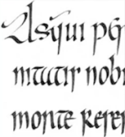
Fig. 3.6 English Half Uncials

Fig. 3.5 Roman Uncials
Roman letters became more rounded by the 4th century.
The curved form allowed for less strokes and could be written faster.

Fig. 3.6 English Half Uncials
8TH C.
In England, the uncial evolved into a more slanted and condensed form.
In England, the uncial evolved into a more slanted and condensed form.


Fig. 3.7 Carolingian Minuscule
Language was standardised, pronunciation and spelling as well as writing conventions.
Capitals at the start of a sentence, spaces between words and punctuation.
New script emerged - Carolingian Minuscule
This style that became the pattern for the Humanistic Writing of the 15th century.


Fig. 3.8 Black Letter in various shapes and forms
12-15 C. CE
12-15 C. CE
Gothic was the culminating artistic expression of the middle ages.
The term Gothic originated with the Italians who used it to refer to rude or barbaric
cultures north of the Italian Alps.


Fig. 3.9 The Italian Renaissance and newly discovered
letterform - Antica
Humanist scholars started to revive the culture of antiquity.
The renaissance analysis of form that was being applied to art and architecture was directed
toward letterform – resulting in a more perfect and rationalised letter.

Fig. 3.10 Moving Type
11 C. - 14 C.
Printing (wood block) had already been practiced in China, Korea and Japan.
China failed to use movable type for printing due to the large number of
characters and the material used.
The innovation was pioneered in China but achieved in Korea.


Fig. 3.11 Evolution of Middle Eastern Alphabets
(left) and the Chinese Script (right)

Fig. 3.12 Brahmi script
450 - 350 B.C.E.
Earliest writing system developed in India after the Indus script.
One of the most influential writing systems - all modern Indian scripts and
several hundred scripts found in
Southeast and East Asia are derived from Brahmi.
Lecture 4: Designing Type
General Process of Type Design:
01
Research
Things we should understand: Type history, type anatomy and
type conventions.
Things we should know: Terminologies, side-bearing, metrics, hinting...
Things we should determine: The purpose of the type or what is it used for.
We should also examine existing fonts for inspiration/ideas/reference/context/usage/pattern etc.
Things we should know: Terminologies, side-bearing, metrics, hinting...
Things we should determine: The purpose of the type or what is it used for.
We should also examine existing fonts for inspiration/ideas/reference/context/usage/pattern etc.
02
Sketching
Some designer sketch using brushes/pens, ink and paper.
Some designers use font design software (much quicker, persistent, and consistent).
Both methods have pros and cons.

Fig. 4.1 Typeface sketch by Eichii Kono
03
Digitalization
Leading professional softwares: FontLab and Glyphs App.
There are designers who use Adobe Illustrator as well to design or craft the letterforms
before importing it into the professional software.
Attention should not only be given to the whole form at this stage but also to the counter
form. The readability of the typeface is heavily dependent on it.
There are designers who use Adobe Illustrator as well to design or craft the letterforms
before importing it into the professional software.
Attention should not only be given to the whole form at this stage but also to the counter
form. The readability of the typeface is heavily dependent on it.

Fig. 4.2 FontLab and Glyphs App
04
Testing
An important component in the design thinking process.
Results of the testing is a part of the process of refining and correcting aspects of the typeface.
Results of the testing is a part of the process of refining and correcting aspects of the typeface.
Prototyping is also part of the testing process and leads to important feedback.
05
Deploy
There are always teething problems that did not appear during the
prototyping and testing phases.
Therefore, the task of revision doesn't end upon deployment.

Fig. 5.3 Contrast in weight
Weigh describes how bold type can stand out in the middle of lighter type of the same style.

Fig. 5.4 Contrast in structure
Structure means the different letterforms of different kinds of typefaces.

Fig. 5.5 Contrast in form
Contrast in form is the distinction between a capital letter and its lowercase equivalent.
Other variants of a typeface are also included under the contrast of form.

Fig. 5.6 Contrast in texture
Contrast of texture can be seen when contrast of size, weight, form, and
structure are put together on a page.

Fig. 5.7 Contrast in direction
Contrast of direction is the opposition between vertical and horizontal,
and the angles in between.

Fig. 5.8 Contrast in color
The use of color is suggested that a second color is often less emphatic in values
than plain black and white. Therefore it is important to give thought to which element
needs to be emphasized and to pay attention to the tonal values of the colors that are used.

Fig. 5.9 Similarity
The gestalt grouping grouping law that states that elements that are
similar to each other tend to be perceived as a unified group.
 Fig. 5.10 Proximity
The gestalt grouping grouping law that states that elements that
are
close to each other tend to be perceived as a unified group.
Items close to each other tend to be grouped together, whereas items
further apart are less likely to be grouped together.

Fig. 5.11 Continuation
The law of continuation holds that humans tend to perceive each of
two or more objects
as different singular, and uninterrupted object even when they intersect.
Alignment of objects or forms play a major role for this principle to take effect.

Fig. 5.12 Closure
The law of closure refers to the mind's tendency to see complete
figures
or forms even if a picture is incomplete.
Therefore, the task of revision doesn't end upon deployment.
Typeface construction


Fig. 4.4 Classification according to form and construction
The 26 characters of the alphabet can be arranged into groups depending on their form and
construction - whereby a distinction is made between a group for the capitals and a group
for lowercase letters.
An important visual correction is the extrusion of curved (and protruding) forms past the
baseline and cap line. A visual correction is also needed for the distance between letters.
White space between letters should appear the same - this is called the "fitting" of the type.

Fig. 4.3 Construction grid for the Roman Capital
using 8 x 8 cells
Using grids can facilitate the construction of a letterform and is a possible method to
build/create/design your letterform.
Using grids can facilitate the construction of a letterform and is a possible method to
build/create/design your letterform.
Construction and considerations

Fig. 4.4 Classification according to form and construction
The 26 characters of the alphabet can be arranged into groups depending on their form and
construction - whereby a distinction is made between a group for the capitals and a group
for lowercase letters.
An important visual correction is the extrusion of curved (and protruding) forms past the
baseline and cap line. A visual correction is also needed for the distance between letters.
White space between letters should appear the same - this is called the "fitting" of the type.
Lecture 5: Perception & Organization
"PERCEPTION"
The way in which something is regarded, understood, or interpreted.

Fig. 5.1 Several methods in typography to create contrast
Carl Dair posits 7 kinds of contrast:
Size, weight, contrast of form, contrast of structure, contrast of texture,
contrast of color and contrast of direction.

Fig. 5.2 Contrast in size
Provides a point to which the reader's attention is drawn.
Common: Making a title or heading noticeably bigger than the body text.

Fig. 5.3 Contrast in weight
Weigh describes how bold type can stand out in the middle of lighter type of the same style.

Fig. 5.4 Contrast in structure
Structure means the different letterforms of different kinds of typefaces.

Fig. 5.5 Contrast in form
Contrast in form is the distinction between a capital letter and its lowercase equivalent.
Other variants of a typeface are also included under the contrast of form.

Fig. 5.6 Contrast in texture
Contrast of texture can be seen when contrast of size, weight, form, and
structure are put together on a page.

Fig. 5.7 Contrast in direction
Contrast of direction is the opposition between vertical and horizontal,
and the angles in between.

Fig. 5.8 Contrast in color
The use of color is suggested that a second color is often less emphatic in values
than plain black and white. Therefore it is important to give thought to which element
needs to be emphasized and to pay attention to the tonal values of the colors that are used.
Form
- Form refers to the overall look and feel of the elements that make up the typographic composition.
- A good form of typography tends to be visually intriguing to the eye; it leads the eye from point to point, it entertains the mind and is most often memorable.
- Originate from the Greek words "typos" (form) and "graphis" (writing).
- Typography can be seen as having two functions: (a) to represent a concept, (b) to do so in visual form
Organization
Gestalt theory emphasizes that the whole of anything is greater than its parts.
Gestalt theory emphasizes that the whole of anything is greater than its parts.

Fig. 5.9 Similarity
The gestalt grouping grouping law that states that elements that are
similar to each other tend to be perceived as a unified group.

close to each other tend to be perceived as a unified group.
Items close to each other tend to be grouped together, whereas items
further apart are less likely to be grouped together.

Fig. 5.11 Continuation
as different singular, and uninterrupted object even when they intersect.
Alignment of objects or forms play a major role for this principle to take effect.

Fig. 5.12 Closure
or forms even if a picture is incomplete.
We are to explore 8 typographic systems (axial, radial,
dilatational, random,
grid, transitional, modular & bilateral) with content provided in the MIB.
grid, transitional, modular & bilateral) with content provided in the MIB.
|
Requirements:
Size: 200mm by 200mm
All attempts:

Fig. 6.1 Axial attempt, Week 2 (8/4/2022)

Fig. 6.2 Radial attempt, Week 2 (8/4/2022)
Among all the typographic systems, I think this was the most challenging to me.
It was hard for me to arrange the information in a way it looks harmonious.
 Fig. 6.3 Dilatational attempt, Week 2 (8/4/2022)

Fig. 6.4 Random attempt, Week 2 (8/4/2022)


Final Exercise 1 - Typographic Systems

Fig. 7.1 Final Axial System - JPEG, Week 2 (10/4/2022)

Fig. 7.2 Final Radial System - JPEG, Week 2 (10/4/2022)


Fig. 7.9 Final Task 1: Exercises - Typographic Systems - PDF, Week 2 (10/4/2022)
Fig. 7.10 Final Task 1: Exercises - Typographic Systems (with guides & guides) - PDF, Week 2 (10/4/2022)
All attempts:

Fig. 6.1 Axial attempt, Week 2 (8/4/2022)
Fonts used:
Futura Md BT (Medium & Bold Italic)
Futura Std (Heavy)
Futura Md BT (Medium & Bold Italic)
Futura Std (Heavy)

Fig. 6.2 Radial attempt, Week 2 (8/4/2022)
Among all the typographic systems, I think this was the most challenging to me.
It was hard for me to arrange the information in a way it looks harmonious.
Fonts used:
Univers LT Std (Condensed, Bold, Bold Condensed, Bold Oblique, Extra Black Extended, Extra Black Extended Oblique)
Univers LT Std (Condensed, Bold, Bold Condensed, Bold Oblique, Extra Black Extended, Extra Black Extended Oblique)

Fonts used:
Futura Std (Heavy)
Futura Std (Heavy)

Fig. 6.4 Random attempt, Week 2 (8/4/2022)
Fonts used:
Adobe Caslon Pro (Italic)
Bodoni MT (Condensed, Bold Italic)
Futura Hv BT (Heavy Italic)
ITC Garamond Std (Book, Bold Italic, Light Condensed)
Univers LT Std (Light Condensed)
Adobe Caslon Pro (Italic)
Bodoni MT (Condensed, Bold Italic)
Futura Hv BT (Heavy Italic)
ITC Garamond Std (Book, Bold Italic, Light Condensed)
Univers LT Std (Light Condensed)


Fig. 6.5 Grid attempts, Week 2 (8/4/2022)
Fonts used:
ITC New Baskerville Std (Bold Italic, Italic)
Univers LT Std (Bold, Light, Light Oblique, Roman)
ITC New Baskerville Std (Bold Italic, Italic)
Univers LT Std (Bold, Light, Light Oblique, Roman)
Fig. 6.6 Transitional attempt, Week 2 (8/4/2022)
Fonts used:
Univers LT Std (Roman)
Univers LT Std (Roman)


Fig. 6.7 Modular attempts, Week 2 (8/4/2022)
Fonts used:
Serifa Std (Bold, Italic, Light, Light Italic, Roman)
ITC New Baskerville Std (Bold Italic)
Univers LT Std (Bold Condensed Oblique)
Serifa Std (Bold, Italic, Light, Light Italic, Roman)
ITC New Baskerville Std (Bold Italic)
Univers LT Std (Bold Condensed Oblique)


Fig. 6.8 Bilateral attempts, Week 2 (8/4/2022)
Fonts used:
ITC New Baskerville Std (Bold Italic, Italic)
Univers LT Std (Bold, Light, Light Condensed Oblique, Roman)
ITC New Baskerville Std (Bold Italic, Italic)
Univers LT Std (Bold, Light, Light Condensed Oblique, Roman)
Fig. 7.1 Final Axial System - JPEG, Week 2 (10/4/2022)
Fig. 7.2 Final Radial System - JPEG, Week 2 (10/4/2022)

Fig. 7.3 Final Dilatational System
- JPEG, Week 2 (10/4/2022)

Fig. 7.4 Final Random System
- JPEG, Week 2 (10/4/2022)

Fig. 7.5 Final Grid System - JPEG,
Week 2 (10/4/2022)
Fig. 7.6 Final Transitional System
- JPEG, Week 2 (10/4/2022)

Fig. 7.7 Final Modular System -
JPEG, Week 2 (10/4/2022)

Fig. 7.8 Final Bilateral System -
JPEG, Week 2 (10/4/2022)
Fig. 7.9 Final Task 1: Exercises - Typographic Systems - PDF, Week 2 (10/4/2022)
Fig. 7.10 Final Task 1: Exercises - Typographic Systems (with guides & guides) - PDF, Week 2 (10/4/2022)
Task 1: Exercise 2 - Type & Play
Part 1: Finding Type
Part 1: Finding Type
Requirements:
|
|
1. Make a selection of image between man-made objects or structures
and nature.
2. Analyze, dissect and identify potential letterforms within the dissected image.
3. Choose a reference typeface from the given 10 typefaces.

Fig. 9.1 Compiled progress, Week 4 (22/4/2021)

Fig. 9.2 Original extracted letterforms compared to the final type design, Week 4 (22/4/2021)
2. Analyze, dissect and identify potential letterforms within the dissected image.
3. Choose a reference typeface from the given 10 typefaces.
1. Chosen Subject

Fig. 8.1 Stained glass pendant light, Week 2 (9/4/2021)


Fig. 8.2 Traced letters - A, C, D, E, Week 3 (13/4/2021)
There were more letters found in the picture but I wanted to focus on the area near the bulb insertion
which hexagonal elements can be found so I decided to work on the letters A, C, E and D.


Fig. 8.5 Overlay, Week 3 (13/4/2021)
Looking at the reference typeface I've chosen, I need to make the width of my letterforms more consistent.

Fig. 8.6 Overview of attempts in Adobe Illustrator, Week 4 (22/4/2021)

Fig. 8.7 Attempt #1 - simplified letterforms, Week 4 (22/4/2021)
After making the width slightly more consistent, I needed to establish what my letterforms
should focus on - I decided to focus on the use of hexagonal shapes in the stained glass
pendant light. From the letters "A", "C" and "E", I can see the hexagonal characters
standing out, so I came up with a more structured form.

Fig. 8.8 Attempt #2 - structured letterforms, Week 4 (22/4/2021)
Here, it looks more structured and I made the horizontal stems thicker, the vertical stems thinner following the characteristics of the pendant light but it's lacking a bit of character from the subject I chose - stained glass.
 Fig. 8.9 Attempt #3 - extracted characteristics, Week 4
(22/4/2021)
Fig. 8.9 Attempt #3 - extracted characteristics, Week 4
(22/4/2021)
So I mimicked the uneven texture and the gaps that are found in the
pattern of the stained glass.

Fig. 8.10 Attempt #4, Week 4 (22/4/2021)
After a feedback session with Mr Vinod, he say I can opt out the uneven texture because
it seemed a bit random. He also noted that my stems are too thin and I should refer to the
thickness of my reference typeface, so I did.


Fig. 8.1 Stained glass pendant light, Week 2 (9/4/2021)
With the assignment in mind, I was shopping in Mid Valley and came
across this stained glass pendant light at a restaurant, I thought
that the pattern on the pendant light would be interesting to
extract some letters from.
2. Letterform extraction


Fig. 8.2 Traced letters - A, C, D, E, Week 3 (13/4/2021)
There were more letters found in the picture but I wanted to focus on the area near the bulb insertion
which hexagonal elements can be found so I decided to work on the letters A, C, E and D.

Fig. 8.3 Extracted letterforms - A, C, D, E, Week 3
(13/4/2021)
From the extracted letterforms, I noticed there are uneven textures,
hexagonal shapes and
different stem thickness involved.
different stem thickness involved.

Fig. 8.4 Typeface reference - ITC Garamond Std
Light Narrow, Week 3 (13/4/2021)
By comparing my extracted letterforms and the 10 given typefaces, I found ITC Garamond
Std Light Narrow the most suitable, because the letters "A", "C" and "E" are very similar in width.
By comparing my extracted letterforms and the 10 given typefaces, I found ITC Garamond
Std Light Narrow the most suitable, because the letters "A", "C" and "E" are very similar in width.

Fig. 8.5 Overlay, Week 3 (13/4/2021)
Looking at the reference typeface I've chosen, I need to make the width of my letterforms more consistent.
3. Digitalization

Fig. 8.6 Overview of attempts in Adobe Illustrator, Week 4 (22/4/2021)
H: 1000 px, W: 2500 px
We are also required to place our letterforms on a baseline.

Fig. 8.7 Attempt #1 - simplified letterforms, Week 4 (22/4/2021)
After making the width slightly more consistent, I needed to establish what my letterforms
should focus on - I decided to focus on the use of hexagonal shapes in the stained glass
pendant light. From the letters "A", "C" and "E", I can see the hexagonal characters
standing out, so I came up with a more structured form.

Fig. 8.8 Attempt #2 - structured letterforms, Week 4 (22/4/2021)
Here, it looks more structured and I made the horizontal stems thicker, the vertical stems thinner following the characteristics of the pendant light but it's lacking a bit of character from the subject I chose - stained glass.


Fig. 8.10 Attempt #4, Week 4 (22/4/2021)
After a feedback session with Mr Vinod, he say I can opt out the uneven texture because
it seemed a bit random. He also noted that my stems are too thin and I should refer to the
thickness of my reference typeface, so I did.

Fig. 8.11 Attempt #5 - thicker stems, Week 4
(22/4/2021)
Mr Vinod didn't say anything about this but I
straightened the stems of letter "A" so it looks
more in line
with the other letters. After making a few changes — this is what I got.
Final Exercise 2 - Part 1: Finding Type

Fig. 9.1 Compiled progress, Week 4 (22/4/2021)

Fig. 9.2 Original extracted letterforms compared to the final type design, Week 4 (22/4/2021)

Fig. 9.3 Final type design - JPEG, Week 4 (22/4/2021)

Fig. 9.4 Letter A - JPEG, Week 4 (22/4/2021)

Fig. 9.5 Letter C - JPEG, Week 4 (22/4/2021)

Fig. 9.6 Letter - JPEG, Week 4 (22/4/2021)

Fig. 9.7 Letter E - JPEG, Week 4 (22/4/2021)

Fig. 9.8 Type showcase - JPEG, Week 4 (22/4/2021)
Fig. 9.9 Final Part 1: Type & Play - PDF, Week 4 (22/4/2021)
Part 2: Type & Image
Requirements:
|
|
(1) To combine a visual with a letter/word/sentence of our choosing.
(2) The objective is to enhance/support the interplay between the letter/word/sentence and the selected visual.
(3) The text must be woven into a symbiotic relationship with the image.
(2) The objective is to enhance/support the interplay between the letter/word/sentence and the selected visual.
(3) The text must be woven into a symbiotic relationship with the image.
Rejected Attempts


Fig. 10.1 Rejected attempts, Week 5 (22/4/2022)
"Integration can be improved."
Attempt #1

Fig. 10.2 Original photo from Pinterest, Week 5 (29/4/2022)

Fig. 10.3 Attempt #1 - "Blur", Week 5 (29/4/2022)
The word "blur" came into mind looking at this image, it is pretty straightforward, so I
used motion blur to emphasize the effect the image originally had.
Font used: Futura Standard (Bold Condensed)

Fig. 10.4 Original photo from Pinterest, Week 5 (29/4/2022)

Fig. 10.5 Attempt #2 - "Do you see me now", Week 5 (29/4/2022)
With the man looking down, I thought I could put focus on his face by making the letters
stay behind him but also at the same time, people can still make up the words even
though the letters were not visually complete at the front. By adding tilt-shift blur,
I think it puts focus on the words "see me" and the subject's face.
Font used: Futura Standard (Bold)
Final Part 2: Type & Image
Fig. 11.1 Final Part 2: Type & Image - JPEG, Week 5 (27/4/2022)
Fig. 11.2 Final Part 2: Type & Image - PDF, Week 5 (27/4/2022)
Week 2 - Typographic Systems
General Feedback: Work have to be done on InDesign. Use up the empty space in the
composition.
Specific Feedback: For dilatational, use up the space to reduce spacing. For random, the white
text could have multiple opacities to make it more layered.
Week 3
General Feedback: Make sure to have a referenced font.
Specific Feedback: Can continue to refine. Keep the hexagonal edges in from the stained glasses. Keep in mind the stems tend to be thicker whenever the alphabet connects.
Specific Feedback: Can continue to refine. Keep the hexagonal edges in from the stained glasses. Keep in mind the stems tend to be thicker whenever the alphabet connects.
Week 4
Specific Feedback: On the right track, but looks a bit too
thin - clumsy looking. Leave the uneven texture out, increase thickness
of the stems.
Week 5
Specific Feedback: Integration can be improved.
Week 7
Specific Feedback: Ex1 - Interesting work, good. Ex2 FT - Good, T&I - Excellent.
Experience
Creating the 8 typographic systems wasn't as easy as I thought especially the radial system, it took me 2 weeks to be finally satisfied with it (although it can still be improved upon), but it also ended up being one of my favorites among the other typographic systems. Exercise 2 - Part 1: Finding Type was the most enjoyable for me, when we were told to extract letters from images of anything. It took me some time to start Exercise 2 - Part 2: Type & Image because I struggled to find images that I wanted to work with so the rejected attempts shown were born (lol).
Observations
I noticed that creating contrast in typography in typographic compositions are important as it helps the information displayey differentiate from each other.
Findings
I was fascinated how letterforms can be found on the most random things, ever. Looking at the progress of how the extracted letterforms become into something that has its own character and identity, it was intriguing. Letterforms can be found everywhere - objects, nature or whatever, if you pay attention. I've found that creating contrast in typography helps organize your design and establish a hierarchy. Good use of contrast also adds visual interest.
I was fascinated how letterforms can be found on the most random things, ever. Looking at the progress of how the extracted letterforms become into something that has its own character and identity, it was intriguing. Letterforms can be found everywhere - objects, nature or whatever, if you pay attention. I've found that creating contrast in typography helps organize your design and establish a hierarchy. Good use of contrast also adds visual interest.


Fig. 12 Examples of visual hierarchy
A visual hierarchy is an arrangement of elements, from the most prominent
to the least prominent, in an area of typographic space.
The relative importance of each element in the message, the nature of the reader,
the environment in which the communication will be read, and the need to create a
cohesive arrangement of forms within the typographic space needs to be considered.
Important contrasts used to create hierarchical arrangements include
size, weight, color, and spatial interval.
Reference
Carter, R., Meggs, P. B., & Day, B. (2007). Typographic design: Form and communication.
Hoboken, N.J: John Wiley & Sons.
Comments
Post a Comment