
Loke Yeanne Tung / 0343853
Bachelor of Design (Hons) in Creative Media / Taylor's University
Advanced Typography / Task 2: Key Artwork & Collateral (30%)
Task 2A: Key Artwork
We are to create a key artwork with our initials/full name which behaves
like a logo, but is also an artwork. Each sketch should be linked to a
potential occupation.
1. Sketches
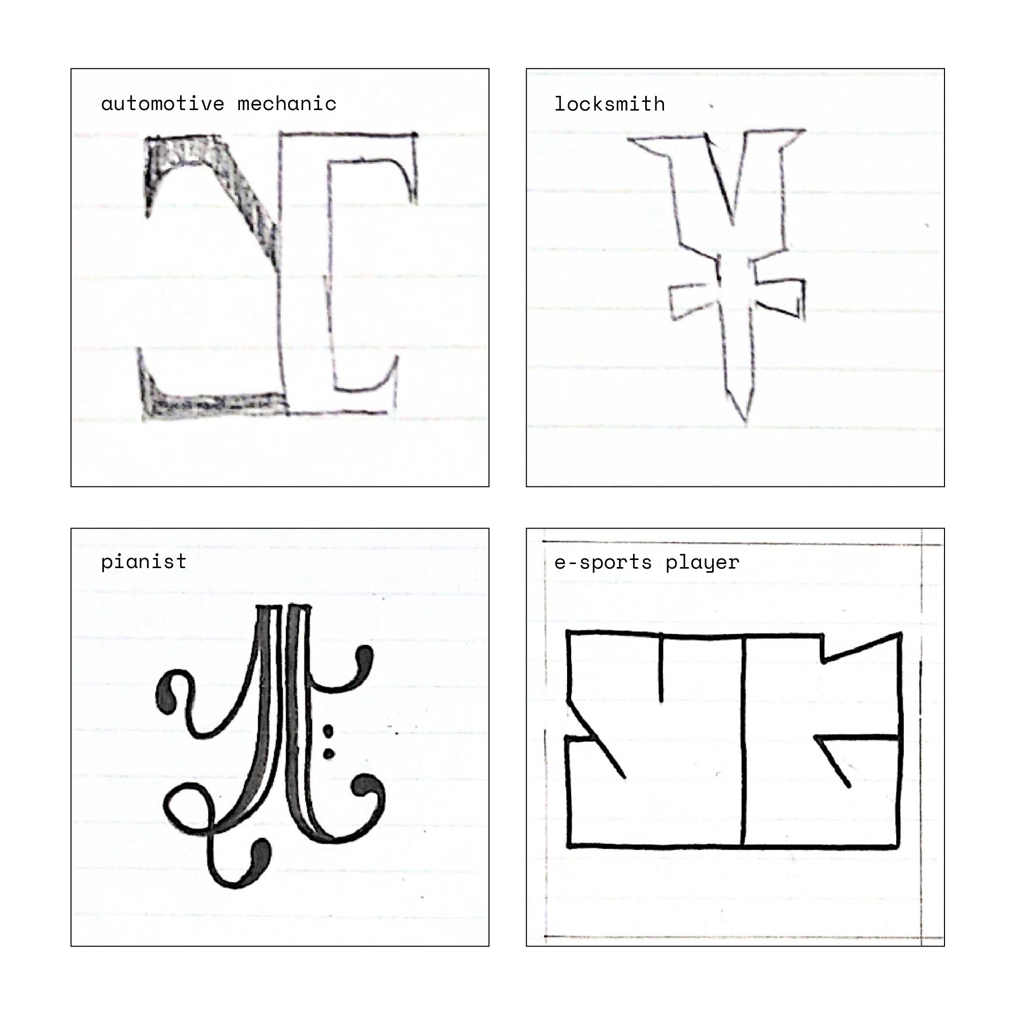
Fig. 1.1 Sketches, Week 7 (13/5/2022)
My approach for this task is to create some sketches with an occupation in mind and some
sketches without an occupation in mind and go about it to see which occupation the sketches
could be linked to. My full initials are LYT but I decided to use just YT by itself because
2-letter initials seems nicer to create.
Top left: The sketch reminded me of car logos such as Rolls Royce with repeated letters, so I thought it could be linked to occupations that's related to cars. That narrowed down to an automotive mechanic.
Top right: It kind of resembles a key without the detailed notches and ridges. The only occupation I could think of for this is a locksmith.
Bottom left: I created this with an occupation in mind which is a pianist. The black and white stems resemble the start of a piano staff. I incorporated the cursive nature that a music note normally would have and also the two dots that a bass clef would have.

Fig. 1.2 Chosen sketch, Week 7 (13/5/2022)
The best out of the four would be this - it reminds me of Grand Theft Auto, a video game
series that I used to play on the PSP with my siblings when I was younger. Therefore, I think
an occupation that's relevant to my sketch would be an esports player.
2. Digitalization

Fig. 2.1 Attempts, Week 8 (20/5/2022)
#1: My first attempt digitalizing the sketch, the slope for "t' is a bit too slanted.
#2: I referred the slanting angle with letter "y"'s tail which I find most suitable. (chosen)
#3: This is my last attempt, I think it enhances the boxiness of the artwork but the "T" is slightly weird to me.


Fig. 2.2 Misalignment of anchor points - before & after,
Week 8 (20/5/2022)
I saw a tiny crooked edge of the artwork when zoomed out in Illustrator. When I zoomed in on
the anchor points, I noticed it was misaligned so I had to fix that.

Fig. 2.5 Final key artwork - black & white, Week 8
(20/5/2022)
Task 2B: Collateral
We are to design a poster, an animated invite and 1 other collateral item of
our choosing, using the key artwork developed in Task 2(A).
|
Requirements:
1. Poster (A3)
2. Animated Invite (800*1024px)
3. 1 relevant collateral of our choosing
1. Poster

Fig. 3.1 Moodboard - sourced from Pinterest, Week 9 (24/5/2022)
For me, esports is always linked with bright and neon colors, so I went with a neon green color
and I also gathered image references on how I want my final Task 2 would look like.

Fig. 3.2 Week 8 poster design attempts, Week 9 (24/5/2022)
Since my key artwork is in a boxy form, it made sense for me to enlarge it and fit the
whole A3. I duplicated and flipped the key artwork horizontally and vertically so it looks
like it's mirrored and symmetrical to each other. The lines also remind me of the light strips
that is often found in esports competition venues.

Fig. 3.3 Refined poster design attempts, Week 9 (24/5/2022)
Based on Mr Vinod's feedback, he said that the information was well-placed but he suggested
changing to a brighter font color instead of grey. He also mentioned that I can also can
incorporate the running text element in the poster and it did looked more exciting.

Fig. 3.4 Final esports tournament poster, Week 9 (28/5/2022)

Fig. 3.5 Simulated esports tournament poster, Week 9
(28/5/2022)
2. Animated Invite
Fig. 4.1 YouTube tutorials I followed, Week 10 (30/5/2022)
I'm weak in After Effects, so I had to find tutorials on YouTube to help me to achieve what I
want my animated invite to look like. I did not follow the tutorial exactly, I only did what
I think was necessary for my GIF animation.

Fig. 4.2 Change of bpc, Week 10 (30/5/2022)
of color. The more bits for each RGB channel (red, green, and blue), the more colors
each pixel can represent.

Fig. 4.3 Layered glow effects, Week 10 (30/5/2022)

Fig. 4.4 WIP in After Effects, Week 10 (30/5/2022)


Fig. 4.5 Animated GIF invitation attempts, Week 10 (30/5/2022)
For some reason, the above attempts looked super laggy, so I tried changing the smoothness
settings under the "random fade up" effect from 0% to 100%. The glow radius was a bit high
so I brought that down too.

Fig. 4.6 Final animated invite - GIF, Week 10 (30/5/2022)
3. Collateral - Access Pass

Fig. 5.1 Esports tournament access pass designs (front),
Week 9 (28/5/2022)
#1 is basically a mini-me of the poster, I wanted something slightly different. #3 is out,
I didn't think it through because access cards usually have a hole for the lanyards to hook
on and that will block out the words "The Prix". #4 was considered but the placement of
text seems cluttered. I went with #2 in the end.

Fig. 5.2 Esports tournament access pass designs (back),
Week 9 (28/5/2022)

Fig. 5.3 Final collateral: Esports tournament access
pass (front), Week 9 (28/5/2022)

Fig. 5.4 Final collateral: Esports tournament access
pass (back), Week 9 (28/5/2022)


Fig. 5.5 & Fig. 5.6 Simulated access pass -
front & back, Week 9 (28/5/2022)
Final Task 2: Key Artwork & Collaterals
Occupation: Esports player


Fig. 6.2 Final key artwork - colored, Week 9 (28/5/2022)

Fig. 6.3 Final poster - esports tournament, Week 9 (28/5/2022)
Fig. 6.4 Simulated esports tournament poster, Week 9
(28/5/2022)
Fig. 6.5 Final animated invite, Week 9 (28/5/2022)


Fig. 6.6 & Fig. 6.7 Final collateral:
Access pass - front & back, Week 9 (28/5/2022)
Fig. 6.8 & Fig. 6.9 Simulated access pass
- front & back, Week 9 (28/5/2022)

Fig. 6.10 Flat lay of Task 2: Key Artwork & Collateral, Week 9 (28/5/2022)
Fig. 6.11 Final Task 2: Key Artwork & Collateral - PDF, Week 9 (28/5/2022)
Week 9
General Feedback: Take a part of your key artwork and make it a
part of your poster.
Specific Feedback: Nice key artwork. Very well-created. Good
placement of information but make "The Prix" bigger. Change to a brighter
font color instead of grey. I can also can incorporate the running text
element in the poster.
Week 12
Specific Feedback: Excellent. KA well adapted in collateral. There's a graphic designer in there somewhere.
Experience
Creating the poster designs for this task especially was super enjoyable for me. Although I like my key artwork, I think I could still explore a bit more in terms of sketches because I didn't have much to begin with. Rendering the animated invite was a pain in the ass, because of how lacking my laptop is, it struggles to render 32bpc work. I had to export, look at the outcome and decide if I was satisfied with it. I rendered around 8 times.
Observation
I noticed that even when using the same point size, a brighter font color rather than a dark one can contribute to visual hierarchy and attract viewer's attention.
Findings
I found that the way we choose our typeface, font style, arrange information, and use color and size in our design defines the poster's character. Typography lets us create a certain atmosphere and have a specific personality in our design.
Comments
Post a Comment