Loke Yeanne Tung / 0343853
Bachelor of Design (Hons) in Creative Media / Taylor's University
Advanced Typography / Task 3: Type Exploration and Application (30%)
Task 3: Type Exploration and Application
BRIEF
|
(1) Develop a font that is intended to be part of a solution in the area of
your interest.
OR
(2) Explore the use of typeface in your area of interest.
The end outcome could be a designed font and its application that it is
intending to provide a solution for, or an exploratory process that solves
a problem or adds value to an existing use.
01
Proposal
Fig 1.1 Proposal, Week 10 (3/6/2022)
To start off this task, we had to propose 3 ideas in the area of our
interest. Mr Vinod suggested
me to continue on with idea #3 as it's seems more feasible and
interesting to work on.
Fig. 1.2 Previous typeface design, Week 10 (3/6/2022)
Some of the letters from the typeface that I created in
Typography module lacked the
"friendly and bubbly" look I was going for. For instance, in
comparison with the other
alphabets, the arc of letter "m" has a sharp feature which I don't
think reflects the
"friendly and bubbly" characteristics of the original
Boo! typeface.
02
Digitization
Fig. 2.1 Measurements, Week 12 (17/6/2022)
Measurements (from baseline)
Ascender line: 675 pt
Cap height: 650 pt
X-height: 500 pt
Descender line: -175 pt
Fig. 2.2 Design progression, Week 12 (19/6/2022)
Before developing the full set of typeface, I had to make changes
to the letters from
the previous version that I wasn't satisfied with - which are the
letters "e", "g",
"i", "m", "t", "y" and the rest of the punctuations.
Fig. 2.3 Typeface features, Week 12 (19/6/2022)
Fig. 2.4 Letter "e" progress, Week 12 (19/6/2022)
For the letter "e", I made the finial more similar to the
ascender of the letter "b"
(refer to Fig. 1.2) which also has a
curvier end. I also made the body more catered
to the oval eye that the original letter "e" has.
Fig. 2.5 Letter "g" and letter "y" progress, Week
12 (19/6/2022)
First thing I want to change for the letters "g" and "y" are the
tails, I noticed
that the inner space between the body and the tail seemed a bit
cluttered and lacked
a flow of movement, so I created more space and curved the bottom
of the tail
more so the letters looks more stable in comparison with the
previous versions.
Fig. 2.6 Letter "i" progress, Week 12 (19/6/2022)
Mr Vinod mentioned the tittle of the "i" need to be slimmer and
longer in height,
so I made the necessary alteration.
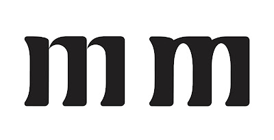
Fig. 2.7 Letter "m" progress, Week 12 (19/6/2022)
Finally, the original letter "m" was the one letter that I was
most not satisfied with among all
the other letters. It's because I find the edges that connects the
shoulders are too sharp
which I don't think suit the look of this particular typeface.
Plus, you can't find this sharp
feature in the other letters, and it looks a bit odd when put
together with the other letters.
The changes I made are making the connecting edges of the arc
thicker and also using ovals
to model the counter spaces in the letter "m" so it is more in
line with the other letters.
Fig. 2.8 Letter "t" progress, Week 12 (19/6/2022)
I made the crossbar of the letter "t" thicker and shorter in
length. Reason being, the
stems in this typeface are generally thicker, so if the crossbar
is overly shorter in
height, it might look a bit unbalanced.
Fig. 2.9 Punctuations progress, Week 12 (19/6/2022)
Fig. 2.10 Letter "j" progress, Week 12 (19/6/2022)
Thought process:
#1: Letter "j" should be easy. It has a tail so it should
look like the letter "g" and "y".
#2: Ok let me put "i" and "j" together. Hmm now it looks a bit
weird and awkward, damn it.
#3: It's fineeee, let me create another letter "j", maybe the
tail could be more similar to
the stems of letters "b", "d", "h" and "p"?
#4: Much better!
Fig. 2.11 Number "3" progress, Week 12 (19/6/2022)
#1: The middle is a bit stiff and not "friendly and bubbly" so I made it look like
the top
finial of the number 3.
#2: Although the bottom finial was aligned to the top finial, the top finial looks like
it's about to topple over, hence I
made the bottom slighter wider then only
it looks visually balanced.
Fig. 2.12 Before and after comparison, Week 12
(19/6/2022)
Fig. 2.13 Full typeface, Week 12 (19/6/2022)
03
Generating the font
For your information, I went through 3 software - FontLab,
Calligraphr and FontForge.
(and it wasn't a pleasant experience)
Fig. 3.1 Fontlab error, Week 13 (24/6/2022)
I didn't save the file up till I finished letter "j", when I saved
it, this warning popped
up. So, I uninstalled and installed FontLab 4 more times before I
give up and move
onto Calligraphr.
Fig. 3.2 "Boo!" on Calligraphr template, Week 13
(24/6/2022)
Following Mr Vinod's tutorial from the Typography playlist and also some exploration
on the Calligraphr website, I managed to upload the template to the website.
Fig. 3.3 Pixilation problem - Calligraphr, Week 13 (24/6/2022)
When editing one letter, I noticed the typeface generated was very pixelated,
but it might be because my letters contain too many anchor points? or I didn't
make the letters big enough on the template.
Fig. 3.4 Lack of functions - Calligraphr, Week 13 (24/6/2022)
After some exploration on Calligraphr, the functions on website are super
lacking compared to FontLab and FontForge. Calligraphr doesn't allow individual
kerning. Nonetheless, I still generated the typeface. I wasn't satisfied at all with the
results so I quickly moved onto FontForge.
Fig. 3.5 Importing typeface into FontForge, Week 13 (24/6/2022)
** Mr Vinod reminded us to place our lowercase/uppercase letters into both the
lowercase and uppercase boxes in the software, so users can use it either way.
To import into FontForge, I had to save SVG files from Adobe Illustrator then only I
can import into FontForge. When I import SVG files into the individual letter boxes,
the letters doesn't align itself to the baseline. In this case, Adobe Illustrator was easier
to use because we could copy and paste straightaway into FontLab.
Fig. 3.6 Screenshot from Mr Vinod's FontLab tutorial video, Week 13 (24/6/2022)
In FontLab, the drop down bar in the metrics window shows multiple phrases which we
could kern, but for some reason FontForge doesn't and I don't know why..(?) So I referred
to Mr Vinod's FontLab tutorial video where I can see the phrases were provided in FontLab.
Fig. 3.7 Phrases which I kerned in FontForge, Week 13 (24/6/2022)
Using the phrases I spot in the screenshot above (refer to Fig. 3.8), I used it for
kerning purposes in FontForge.
Fig. 3.8 Kerning in FontForge tutorial video, Week 13 (24/6/2022)
Fig. 3.9 Lookup tables for kerning, Week 13 (24/6/2022)
I did not know how to kern in Fontforge, because a pop up window asked me
to create look up tables to enable kerning. So I referred to the above tutorial
video to proceed.
04
Application
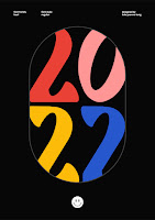
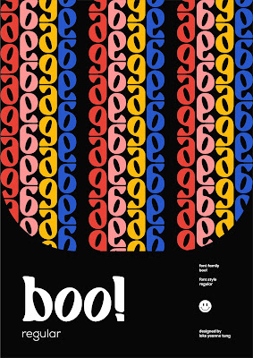
Fig. 4.1 Type display poster, Week 14 (29/6/2022)
Fig. 4.2 Sample words, Week 14 (29/6/2022)
I decided to use the 4 letters from the typeface that I liked the most to
create sample words at the same time showing viewers the potential of
my typeface to be used for commercial purposes.
Fig. 4.3 Sample words, Week 14 (29/6/2022)
I generated a color palette which reflects the personality of my typeface to
use it in the applications.
Fig. 4.4 Type display poster options, Week 14 (29/6/2022)
Honestly, this was the most challenging part. I didn't know how I should display my
typeface on the posters. I felt like I should do more, but due to time constraint I decided
to leave it and use what I have for submission.
Fig. 4.4 Simulated type display posters, Week 14 (29/6/2022)
Application #2: Collaterals
Fig. 4.5 Type display card design, Week 14 (29/6/2022)
Final Task 3: Type Exploration and Application
Problem: The previous outcome of the typeface doesn't
reflect the "friendly and bubbly" look I was going for.
Application: Promotional material (posters and
collaterals)
Download Boo!.ttf here: https://drive.google.com/file/d/1syCVgn2_Ap-Rf_RVmNKDkbHxFkFfI93P/view?usp=sharing
Fig. 5.1 "Boo!" - final type design, Week 14 (30/6/2022)
Fig. 5.2 "Boo!" - final type design (on baseline), Week 14
(30/6/2022)
Fig. 5.3 "Boo!" - final type, Week 14 (30/6/2022)
Fig. 5.4 Sample type display #1, Week 14 (30/6/2022)
Fig. 5.5 Sample type display #2, Week 14 (30/6/2022)
Application #1: Type display posters
Fig. 5.6 Type display poster #1, Week 14 (30/6/2022)
Fig. 5.7 Type display poster #2, Week 14 (30/6/2022)
Fig. 5.8 Type display poster #3, Week 14 (30/6/2022)
Fig. 5.9 Type display poster #4, Week 14 (30/6/2022)
Fig. 5.10 Simulated type display poster, Week 14
(30/6/2022)
Application #2: Collaterals
Fig. 5.11 Simulated type display cards #1, Week 14 (30/6/2022)
Fig. 5.13 Simulated type display badge, Week 14 (30/6/2022)
Fig. 5.14 Simulated type display tape, Week 14
(30/6/2022)
Fig. 5.15 Collaterals flatlay, Week 14 (30/6/2022)
Fig. 5.16 Final Task 3: Type
Exploration and Application - PDF, Week 14 (30/6/2022)
Week 10
- Idea 3 is interesting.
- Retain the problem of the typeface being a bubbly inspired typeface.
- Play with different compositions, show simulations that makes sense with the particular expression you have in mind.
- Mr Vinod would refine the exclamation mark, maybe taper a little bit more so that the bottom is not as wide.
- The dot of the "i" have to be bigger/longer.
- It's a nice typeface to develop and if the typeface is good, Mr Vinod will add it to his book that he will eventually launch on a site.
Week 13
- Try to develop the full typeface during the holidays for copyrighting.
- Haven't yet to see the application of the typeface.
Week 14
- Excellent work, complete the capitals during the holidays to submit for copyrighting.
- However I still could do more for the promotional posters.
- The numbers look great, number 9 could work a bit more but still quite good.
REFLECTION
Experience
I started off a bit late with this task as I already had a few letters
developed to begin with. Also, I had other tasks from other modules to
work on, so it was a bit hectic. I had problem(s) generating the typeface, and it took up so much of my mental energy. This task was by far the most challenging, I
did not know how I should display my typeface on posters for the
application. As the brief is slightly abstract, I wasn't sure if I did
enough or was I doing the right thing.
Observation
I observed that recording progression of my work is a very difficult
thing for me to do, I often neglect that part and end up having just the
initial and final product without having an in-between. While crafting
some of the letters and numbers of a typeface, I was reminded that some
have a wider bottom than the top.
Findings
I found that Calligraphr is not a good software to work with. I realised
Fontlab was the best among Calligraphr, Fontforge and Fontlab. I've
learnt that Fontforge sucks as aligning letters. I've learnt that before
converting my typeface into a font generating software, my typeface in
Illustrator should have as little points as possible so it is more
accurate when imported into the software.


Look up the video tut. here and you will find a better way I believe: https://kreatifbeats.com/creating-a-font-with-font-forge/
ReplyDelete