Loke Yeanne Tung / 0343853
Bachelor of Design (Hons) in Creative Media / Taylor's University
Advanced Typography / Final Compilation and Reflection
LINKS
Task 1:
Exercises
Task 2:
Key Artwork and Collateral
Task 3:
Type Exploration and Application
SUBMISSIONS
Task 1: Exercise 1 - Typographic Systems (48h)
1/4/2022 - 15/4/2022 / Week 1 - Week 3

Fig. 1.1 Final Axial System - JPEG, Week 2 (10/4/2022)

Fig. 1.2 Final Radial System - JPEG, Week 2 (10/4/2022)
Fig. 1.3 Final Dilatational System - JPEG, Week 2
(10/4/2022)
Fig. 1.4 Final Random System - JPEG, Week
2 (10/4/2022)
Fig. 1.5 Final Grid System - JPEG, Week 2
(10/4/2022)
Fig. 1.6 Final Transitional System - JPEG, Week 2
(10/4/2022)
Fig. 1.8 Final Bilateral System - JPEG, Week 2
(10/4/2022)
Fig. 1.9 Final Task 1: Exercises - Typographic Systems - PDF, Week 2 (10/4/2022)
Fig. 1.10 Final Task 1: Exercises - Typographic Systems (with guides & guides) - PDF, Week 2 (10/4/2022)
Task 1: Exercise 2 - Type and Play (30h)
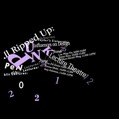
Part 1 - Finding Type
15/4/2022 - 29/4/2022 / Week 3 - Week 5
Fig. 2.9 Final Part 1: Type & Play - PDF, Week 4 (22/4/2021)
Task 1: Exercise 2 - Type and Play (5h)
Part 2 - Type and Image
29/4/2022 - 6/5/2022 / Week 5 - Week 6
Task 2: Key Artwork and Collaterals (56h)
6/5/2022 - 3/6/2022 / Week 6 - Week 9
Fig. 4.2 Final key artwork - colored, Week 9 (28/5/2022)
Fig. 4.3 Final poster - esports tournament, Week 9
(28/5/2022)
Fig. 4.4 Simulated esports tournament poster, Week 9
(28/5/2022)
Fig. 4.5 Final animated invite, Week 9 (28/5/2022)
Fig. 4.6 & Fig. 4.7 Final collateral: Access
pass - front & back, Week 9 (28/5/2022)
Task 3: Type Exploration and Application (68h)
3/6/2022 - 1/7/2022 / Week 10 - Week 14
Problem: The previous outcome of the typeface doesn't reflect the "friendly and bubbly" look I was going for.
Application: Promotional material (posters and collaterals)
Download Boo!.ttf here: https://drive.google.com/file/d/1syCVgn2_Ap-Rf_RVmNKDkbHxFkFfI93P/view?usp=sharing
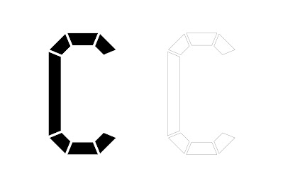
Fig. 5.1 "Boo!" - final type design, Week 14
(30/6/2022)
Fig. 5.2 "Boo!" - final type design
(on baseline), Week 14 (30/6/2022)
Fig. 5.3 "Boo!" - final type, Week
14 (30/6/2022)
Fig. 5.4 Sample type display #1,
Week 14 (30/6/2022)
Fig. 5.5 Sample type display #2, Week
14 (30/6/2022)
Application #1: Type display posters
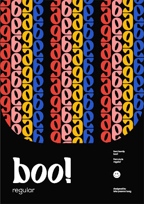
Fig. 5.6 Type display poster #1,
Week 14 (30/6/2022)
Fig. 5.7 Type display poster #2,
Week 14 (30/6/2022)
Fig. 5.8 Type display poster #3,
Week 14 (30/6/2022)
Fig. 5.9 Type display poster
#4, Week 14 (30/6/2022)
Fig. 5.10 Simulated type
display posters, Week 14 (30/6/2022)
Application #2: Collaterals
Fig. 5.11 Simulated type display cards #1, Week 14 (30/6/2022)
Fig. 5.13 Simulated type display
badge, Week 14 (30/6/2022)
Fig. 5.16 Final Task 3: Type
Exploration and Application - PDF, Week 14 (30/6/2022)
Experience
Overall, I find Advanced Typography more enjoyable than Typography in Semester 1. Maybe it's because I'm fully adapted to Mr Vinod's system (maybe not lol). I enjoyed most of the tasks in this module, I was definitely more passionate in typography than before, I would say? The typographic systems took me the longest to get started on, I think it's because I haven't get to use InDesign that much after the Typography module so I didn't want to relearn it, but I managed to finish it. I had problem creating the radial system but I end up liking that the most. Finding type in objects was interesting because I did not know I could find letters in anything we are in contact with. Task 2 was my favorite, because I got to create an artwork related to my initials. Task 3 was the most challenging, I did not know how I should display my typeface on posters for the application.
Observation
I observed that recording progression of my work is a very difficult thing for me to do, I often neglect that part and end up having just the initial and final product without having an in-between. While crafting some of the letters and numbers of a typeface, I was reminded that some have a wider bottom than the top.
Findings
I found that Calligraphr is not a good software to work with. I realised FontLab was the best among Calligraphr, Fontforge and Fontlab. I've learnt that Fontforge sucks as aligning letters. I've learnt that before converting my typeface into a font generating software, my typeface in Illustrator should have as little points as possible so it is more accurate when imported into the software.


Comments
Post a Comment